How to make users scroll down your page
Published: May 2024

In A/B tests, long webpages often beat shorter pages. But for a long page to be effective, readers must be aware that it’s long. If users don’t scroll—because they don’t want to or because they aren’t aware that the page is long—then all of your hard work has gone to waste.
Raising the engagement of your pages can make a huge difference to your revenue. In one of our Win Reports, we showed how encouraging users to scroll increased a page’s conversion rate by 36%.
In this article, you’ll learn why you should test longer pages and:
- How to find your fold.
- Two techniques you can use to understand what users see.
- Five techniques that encourage scrolling (and some fun extras).
Plus, an X/Twitter post that made us smile.
Scroll down to learn more 😉
Why you should be testing long pages
As a rule of thumb, a webpage that sells should contain at least as many words as you would need to sell your product or service face-to-face. That’s because the page doesn’t have the luxury of asking for specific objections, so your content needs to address all of your customers’ common questions.
When Moz’s CEO, Rand Fishkin, told us that it took him about nine minutes to sell Moz’s PRO service face-to-face, we realized that the landing page would have to be long. The winning page we designed for Moz was six times longer than the control, which it outperformed by 52%.
Some marketers are wary of long pages, associating them with aggressive sales techniques, but consider the world’s most successful online retailer. A typical Amazon sales page is very long, containing product details, images, videos, frequently asked questions, comparisons with other products, alternative options, and reviews.
Watch the video to see just how long the Amazon Kindle page is:
Adding a huge amount of content works for Amazon, so it’s no surprise that they work for many others too. The page we created for GoHenry was four times longer than the original but increased the conversion rate by 78%.
Long pages work. The challenge is getting users to scroll down and see the content.
Why you should still care about the fold
In digital marketing, the term “above the fold” refers to the content that users can see without scrolling. (It was borrowed from newspaper publishing, but really just means the default view.)
Of course, the default view of a webpage can vary wildly depending on how it’s viewed. Different devices combine different screens, operating systems, browsers, toolbars, accessibility options, and so on. Each can shift and muddy the position of the fold on a webpage.
And yet, knowing what most users see (and how far they scroll) remains a critical tool for Conversion Rate Optimization (CRO).
Here are two ways to determine whether your users are missing important content because they aren’t scrolling:
- Conduct usability tests and observe whether users scroll.
- Use a tool like Hotjar, which can create visual scroll maps that show how visitors scroll through your website.
Here’s the desktop scroll map we referenced in our iFLY Win Report. The most viewed content is clearly visible (in red).
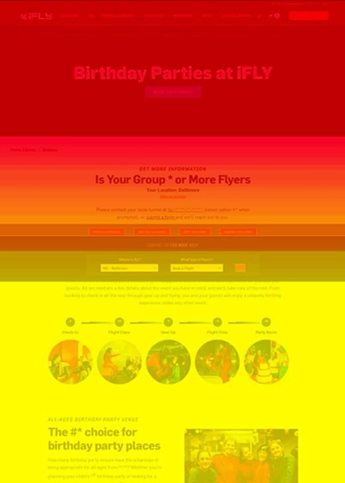
When we tested an alternate design that moved key content up the page and encouraged users to scroll, the conversion rate rose by 36%. The lines may have blurred, but optimizing what users see can still make a huge difference to your business.
Six techniques to encourage users to scroll
It should go without saying, but the single best way to get users to scroll is to create great content. That said, here are five design strategies that can improve scrolling problems.
1. Avoid false bottoms
If your page has empty space or a horizontal band near the fold, some users may unconsciously “read it” as the end of the content. This is called a “false bottom.”
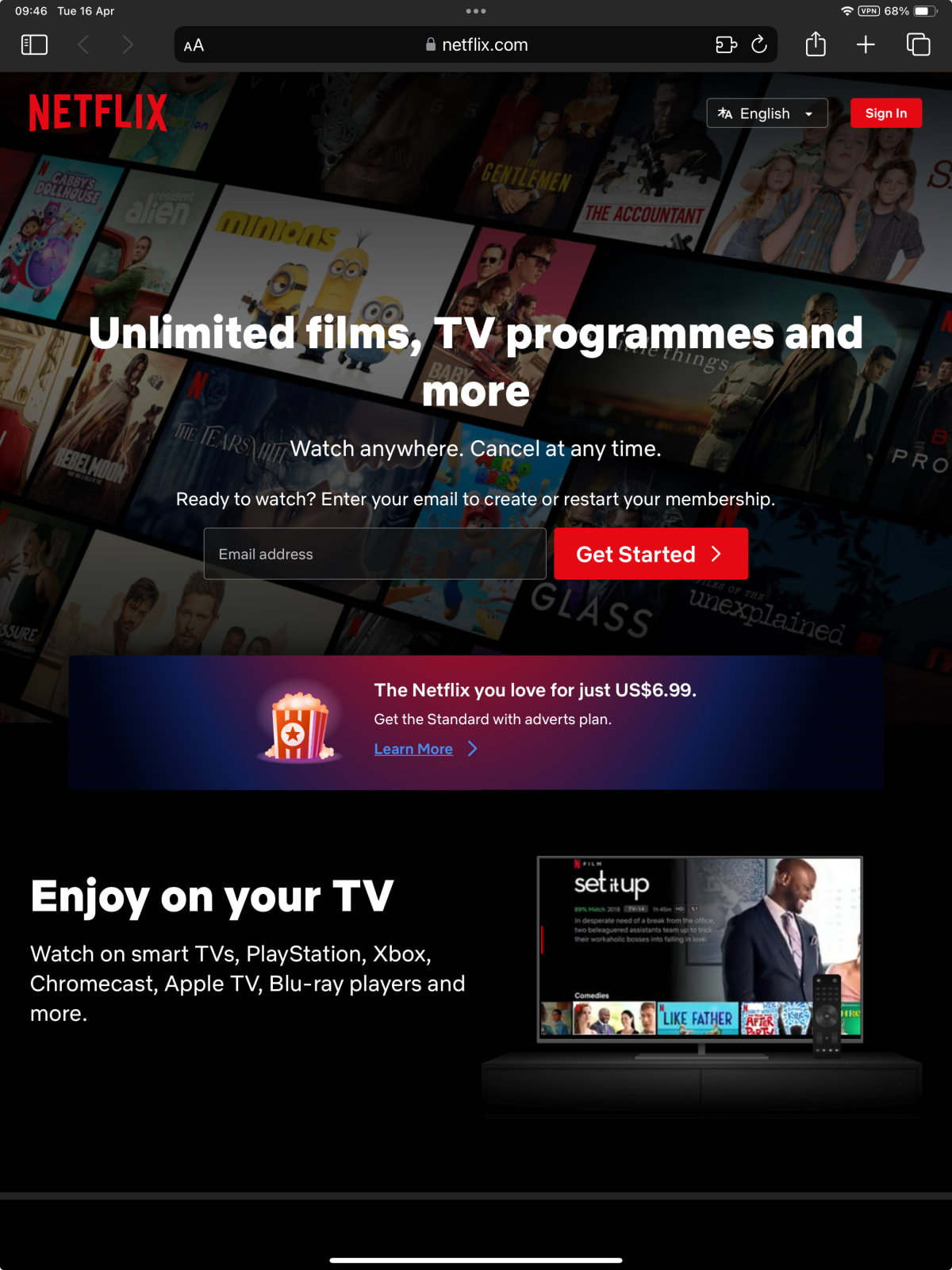
Netflix.com’s homepage is a long page, but some users might not realize that it continues below.
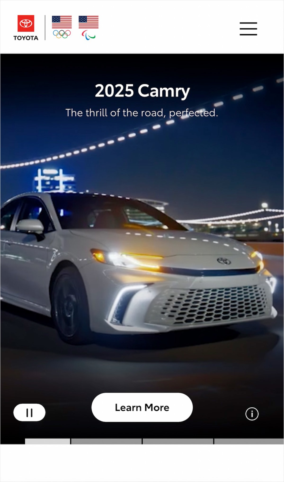
Here’s a similar gap on the Toyota.com homepage.
The easiest way to avoid a false bottom is to ensure that content elements “break” through the fold. (Then, you can let the Gestalt effect do its work.)
If a page element appears incomplete, users will understand that it continues below. On multi-column layouts, it can be helpful to have columns end at different heights.
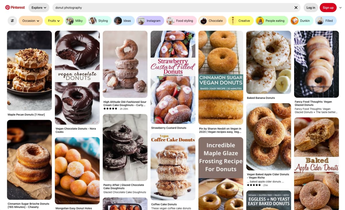
Pinterest takes this approach to an extreme to promote endless scrolling.
2. Make it clear that there’s more
If your content or layout risks a false bottom, consider adding an explicit signal that there is more content below. Disney+ adds an animated arrow to indicate that there is more content below.
The arrow is less effective than having content break through the bottom of the screen, but it does at least indicate that there is more to see.
The Hustle (from Hubspot) stretches a strong red line further across the page each time you scroll, showing how far you are through the content (and how much remains).
Some sites are more explicit. Although Gucci’s homepage breaks through the bottom on this phone, the page includes an explicit “Scroll to Discover More” message for users with shallower screens.

“Discover more” is a generic request, but the better reason we give our readers to scroll, the more likely they are to do it.
3. Give your readers compelling reasons to scroll
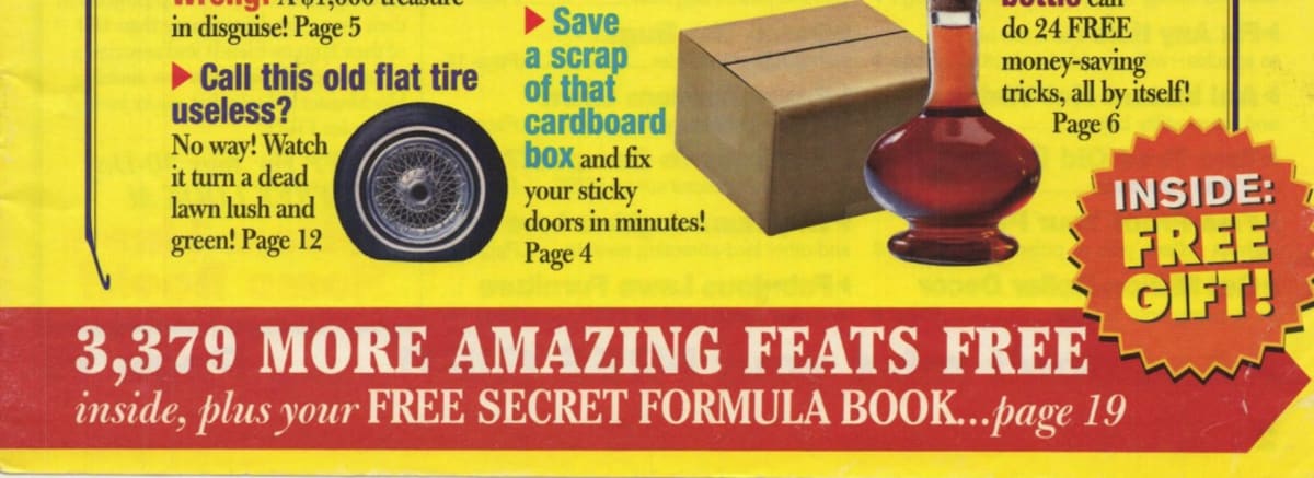
Offline marketers have long known the importance of motivating people to read on. Here’s a classic example.
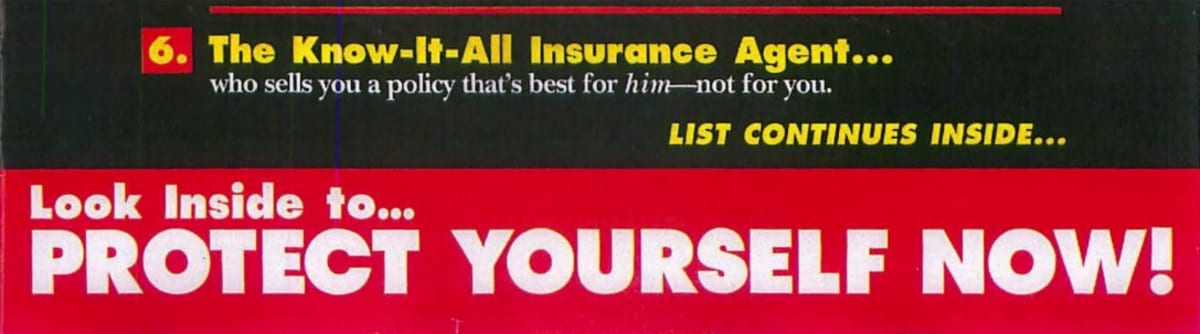
And, of course, everyone loves a FREE GIFT!
The modern web may not be quite so explicit in its requests for scrolling, but we can all benefit from telling our readers what they’ll get from our content. Our article on how the world’s best companies build unbeatable focus uses a Johnson Box to list some compelling reasons for users to read on.
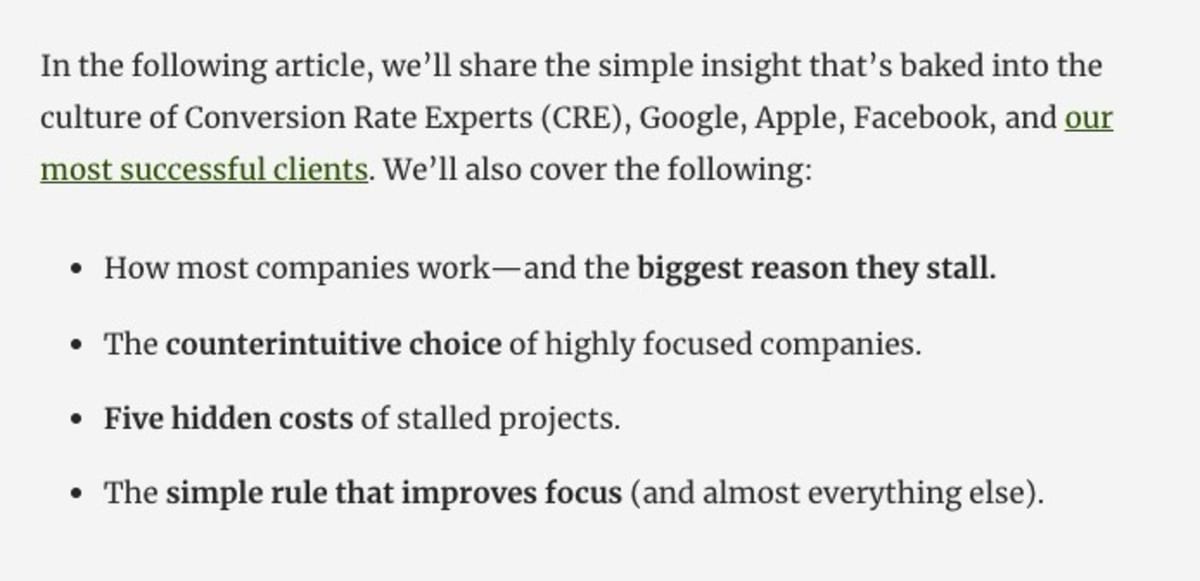
Johnson Boxes have a special place in our hearts, but the reason to scroll could just as easily be a special offer, a content upgrade, or a promise made in the body copy.
If your reader is looking for a reason to scroll, give them a benefit. Anything is likely to outperform a reasonless call to action.
(We combined this technique with the following one for Custody X Change and boosted their website conversion rate by 20%.)
4. Add “click-to-scroll” functionality
Although longer pages often beat shorter ones, not every user will read every piece of content. Each user just wants the content they care about. Giving them a way to jump to the bit they need can often improve engagement (and conversion).
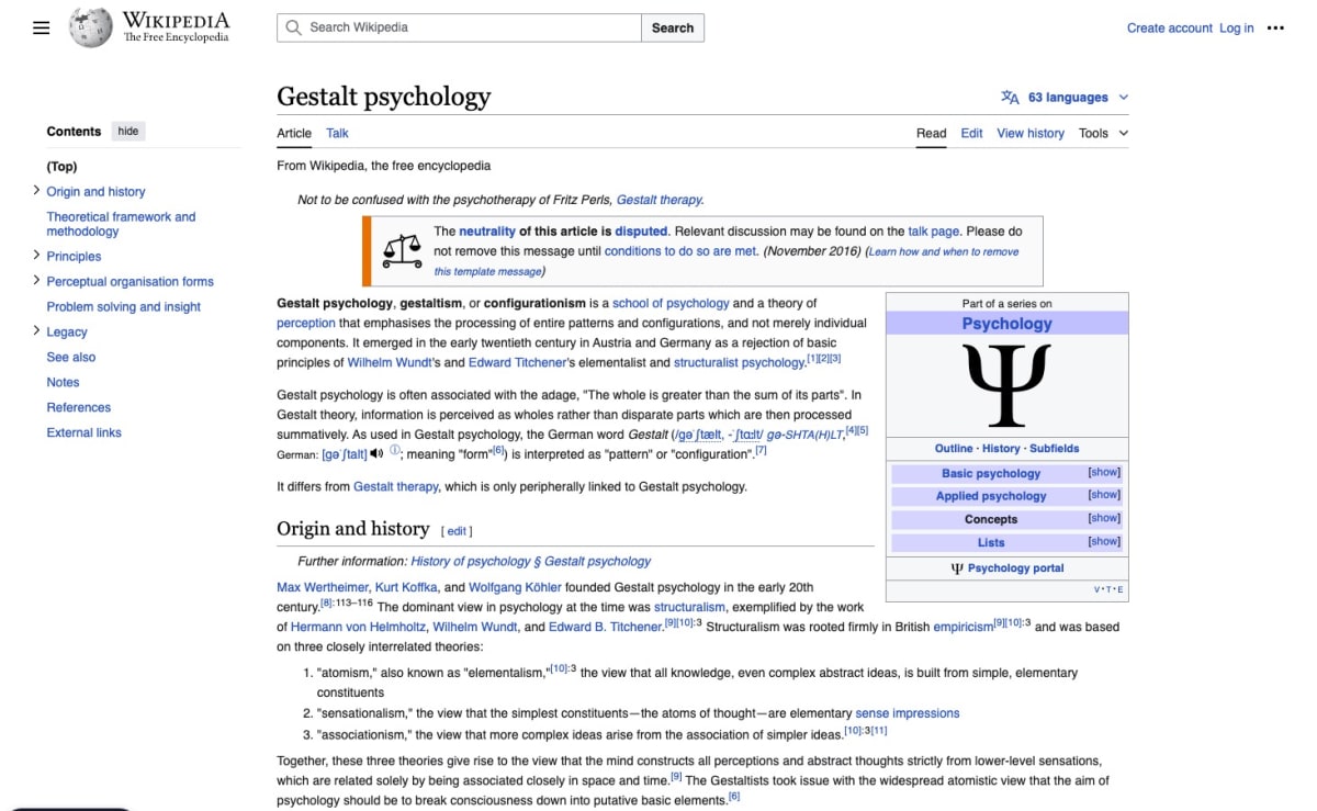
Here’s Wikipedia’s desktop view with the left-hand menu:
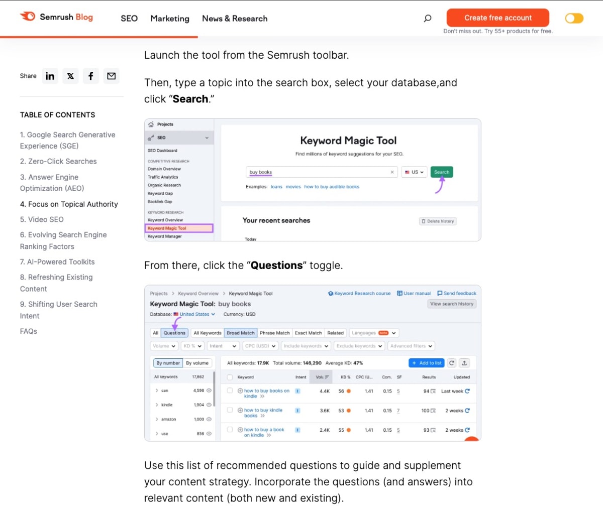
Here’s a similar example from Semrush’s blog, adding a table of contents and a scroll line across the top of the page:
Making it easier for your users to get what they want is as close to a safe bet as we know in Conversion Rate Optimization. If you test long sales pages (as we recommend you do), consider adding in-page navigation.
Here’s an alternative example. As you scroll down a Best Buy sales page, a “sticky” sub-menu appears at the top showing where you are in the content (and where you can jump to).
5. Add a sticky call to action
Sticky calls to action don’t explicitly encourage scrolling, but they do allow users to take action the moment they are ready.
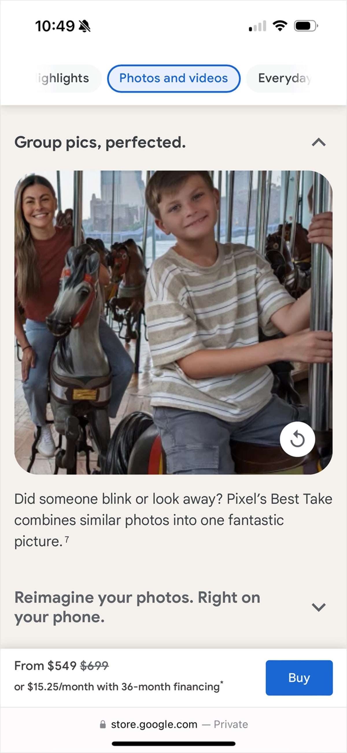
On the sales page for its Pixel 8 phones, Google includes a blue “Buy” button (top right) that “sticks” in place as you scroll down the page.
The mobile version of the page moves the sticky button to the bottom of the screen and adds in-page links to the top (see technique 4).
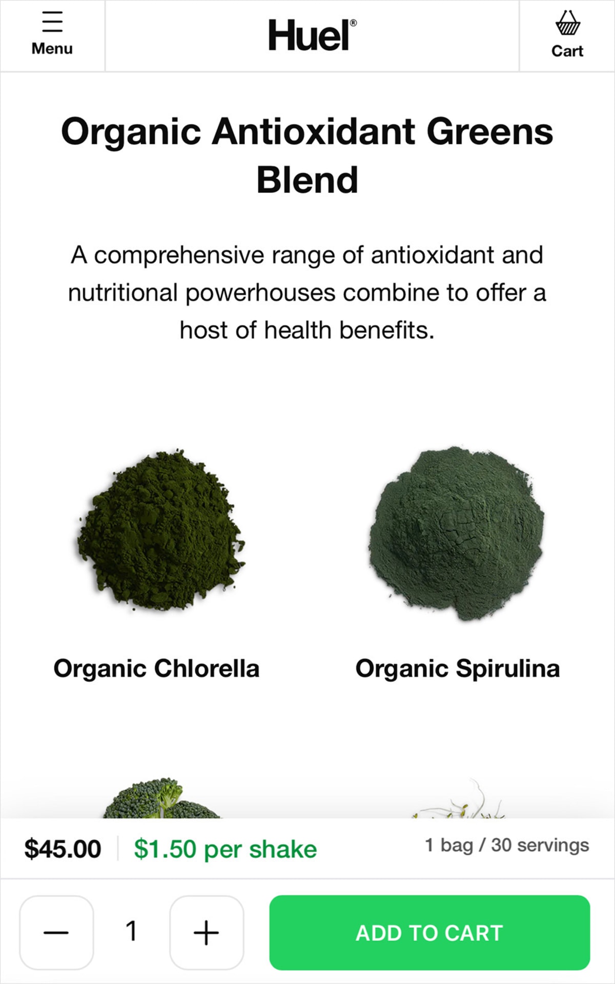
Here’s a similar example from Huel.
In one test we ran on a very long sales page, adding a sticky call to action increased sales by 25%.
And finally… for a bit of fun, put on a BIG show (with scrolling animation)
We wouldn’t necessarily recommend these three examples if you are looking to improve your conversion rate, but they did encourage us to scroll.
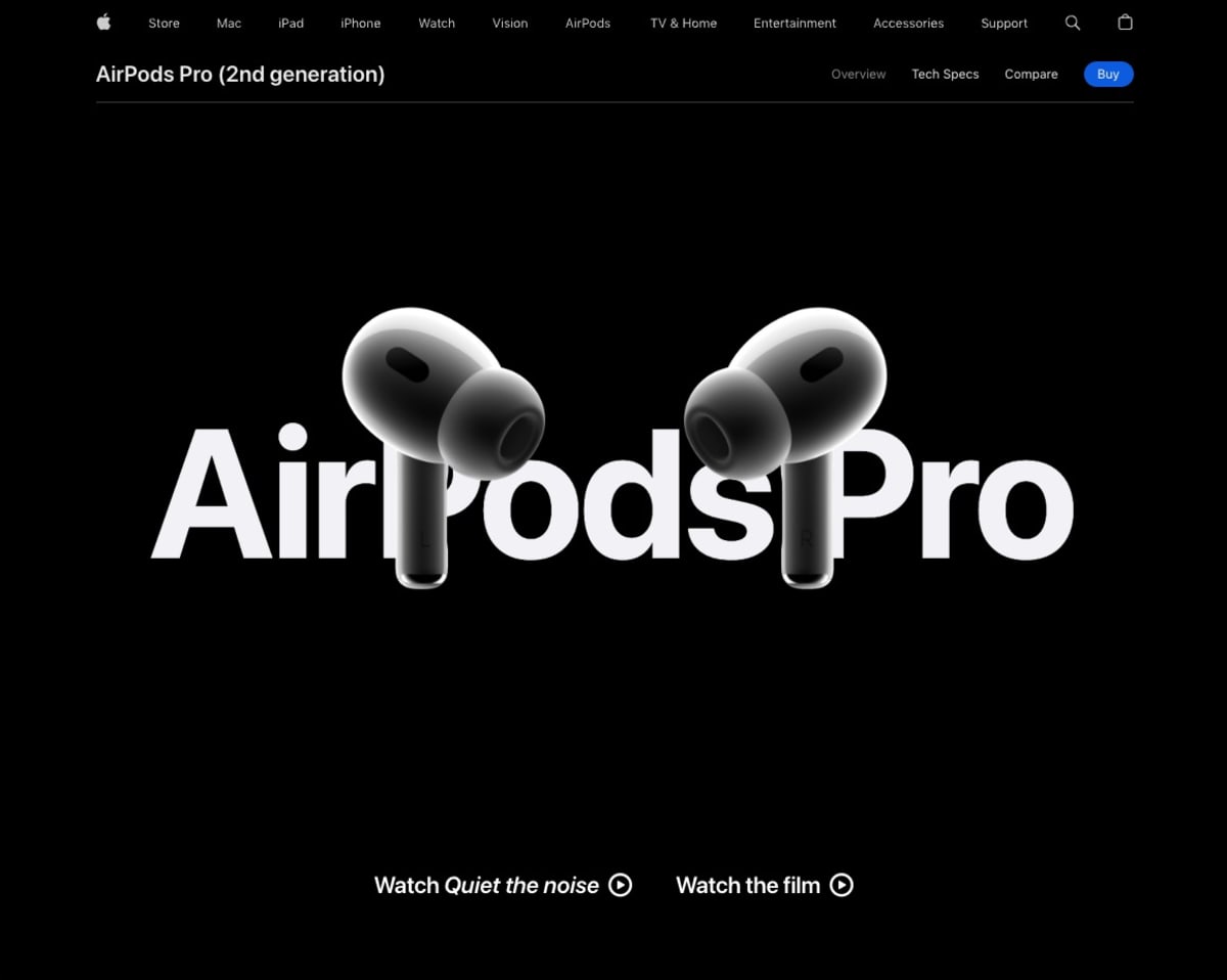
Apple’s Airpods Pro page (try saying that after a party) contains lots of space, but the sales content dances and animates every time the user scrolls.
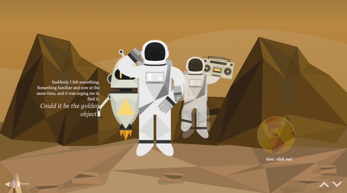
NASA: Prospect lets every kid imagine themselves as an astronaut (however old they may by in earth years!)
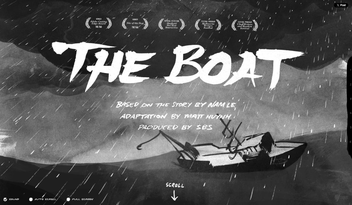
The Boat is an award-winning graphic novel set after the Vietnam War.
Conclusion: Don’t rest. Test.
Long pages are effective, but only if your users know that they can scroll and have compelling reasons to do so.
That’s why we’re looking forward to seeing the scroll maps for this page. Checking (and improving) our work is part of our methodology.
In the meantime, we’ll leave you with the advice we once saw on Twitter:
“Before you close a web page, make sure you scroll up to the top, so it’s in the right position for the next person.”
How much did you like this article?
What’s your goal today?
1. Hire us to grow your company
We’ve generated hundreds of millions for our clients, using our unique CRE Methodology™. To discover how we can help grow your business:
- Read our case studies, client success stories, and video testimonials.
- Learn about us, and our unique values, beliefs and quirks.
- Visit our “Services” page to see the process by which we assess whether we’re a good fit for each other.
- Schedule your FREE website strategy session with one of our renowned experts.
Schedule your FREE strategy session
2. Learn how to do conversion
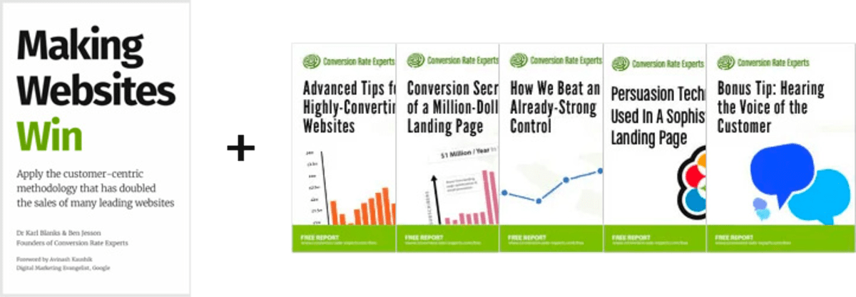
Download a free copy of our Amazon #1 best-selling book, Making Websites Win, recommended by Google, Facebook, Microsoft, Moz, Econsultancy, and many more industry leaders. You’ll also be subscribed to our email newsletter and notified whenever we publish new articles or have something interesting to share.
Browse hundreds of articles, containing an amazing number of useful tools and techniques. Many readers tell us they have doubled their sales by following the advice in these articles.
Download a free copy of our best-selling book
3. Join our team
If you want to join our team—or discover why our team members love working with us—then see our “Careers” page.
4. Contact us
We help businesses worldwide, so get in touch!
© 2024 Conversion Rate Experts Limited. All rights reserved.